











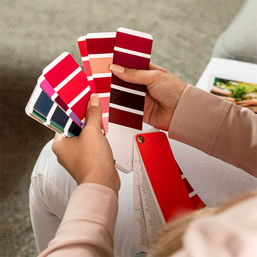
Best Color Schemes for Living Room: A Complete Guide to Stylish Spaces
Choosing the right living room color scheme is one of the most important decisions in creating a comfortable and visually balanced home. In 2026, homeowners are moving beyond one-size-fits-all color trends and paying more attention to how paint colors interact with natural light, furniture, flooring, and the overall style of a space. From warm neutrals and earthy greens to timeless navy, soft whites, and bold accent colors, the best living room color schemes are the ones that complement your home’s architecture while supporting the way you actually use the room.
Best Living Room Color Schemes for 2026: Key Takeaways
- Choose colors based on your space: Consider room size, natural light, furniture, flooring, and how the living room is used before selecting a color palette.
- Warm neutrals remain highly versatile: Beige, cream, taupe, warm gray, and soft brown can create a comfortable foundation for both traditional and modern living rooms.
- Natural light changes how colors look: North-, south-, east-, and west-facing rooms can make the same paint color appear noticeably different throughout the day.
- Coordinate colors with existing finishes: Wall colors should complement sofas, wood flooring, stone, curtains, rugs, and other permanent elements rather than being selected independently.
- 2026 color trends favor warmer palettes: Earthy tones, muted greens, warm browns, and nature-inspired neutrals are increasingly popular for creating layered and inviting interiors.
- Use accent colors strategically: Navy, emerald green, terracotta, black, brass, and other stronger tones can add personality without overwhelming the main color scheme.
- Always test paint before committing: Evaluate real paint samples on the wall at different times of day to see how lighting affects the final appearance.
- The best color scheme is personal: Trends can provide inspiration, but the ideal living room palette should match your home’s architecture, lifestyle, existing materials, and personal taste.

Transform Your Space with BUILPIRE – Book Your Consultation Today!
Why Color Schemes Matter in the Living Room
The living room is typically the most used space in a home. It’s where families gather, friends visit, and relaxation happens. Because of its central role, your living room should reflect your taste while providing comfort. The color scheme forms the foundation of the room’s ambiance and influences every other design choice, from furniture to accessories.
Choosing the best color schemes for living room ensures the space feels cohesive and balanced. An effective color palette can tie together all the elements in the room, from the sofa fabric to the wall art. Whether you prefer minimalist elegance or colorful expression, your color choices make a statement.
Top 10 Best Color Schemes for Living Room
1. Neutral Elegance: Beige, Cream, and White
A timeless choice, this neutral palette provides flexibility and a clean look. Accentuate with wood textures and soft lighting for a cozy and sophisticated atmosphere. It’s ideal for small spaces where you want to maximize light.
2. Modern Monochrome: Shades of Gray
Gray offers a sleek, modern vibe. Combine dark charcoal with light silver tones and add black or white accents for contrast. This scheme is perfect for those who want a chic, urban style without bold colors.
3. Earthy Tones: Terracotta, Olive Green, and Sand
These warm, grounded colors make any space feel welcoming and connected to nature. Add in wooden elements, linen fabrics, and indoor plants to enhance the natural vibe.
4. Coastal Blues: Navy, Sky Blue, and White
If you want a relaxed, beachy feel, this color scheme is a fantastic option. The blues bring calmness, while the white adds brightness. Use rattan or light wood furniture for a breezy, coastal look.
5. Bold and Beautiful: Emerald Green, Gold, and Black
For a luxurious and dramatic living room, go bold. Emerald green walls with gold accents and black furniture exude confidence and elegance. Best used in larger rooms or spaces with high ceilings.
6. Scandinavian Cool: White, Light Gray, and Pale Wood
Minimalist yet cozy, this palette emphasizes light and simplicity. Scandinavian design focuses on functionality, so these colors support a decluttered, airy aesthetic.
7. Sunset Warmth: Coral, Peach, and Soft Yellow
Bring warmth and energy into your living room with a palette inspired by sunsets. These hues are great for energizing the space and work well in both traditional and modern interiors.
8. Moody Luxe: Deep Blue, Burnt Orange, and Brass
If you want drama and sophistication, these rich hues can transform your living room. Add brass light fixtures and velvet textures for extra elegance.
9. Pastel Serenity: Lavender, Pale Blue, and Soft Pink
Pastel colors create a soft, calming atmosphere—great for relaxation and mindfulness. Mix in white accents and delicate fabrics to enhance the gentle vibe.
10. Black and White Classic
Sometimes, simplicity is key. A black and white scheme offers a striking contrast and never goes out of style. Use patterns and textures to add depth and interest.
How to Choose the Best Color Scheme for Your Living Room
-
Consider Your Natural Light
Rooms with lots of natural light can handle darker shades, while dim rooms benefit from light, reflective colors. -
Think About Your Lifestyle
Do you host guests often or use the space primarily for relaxing? High-traffic areas might need colors that hide wear and tear. -
Evaluate Existing Furniture
If you’re not starting from scratch, consider the colors of your current furniture and work around them. -
Use the 60-30-10 Rule
This classic interior design rule helps maintain balance: 60% main color, 30% secondary color, and 10% accent color.
Don’t judge a living room paint color from a small digital image alone. Natural and artificial lighting can significantly influence how a color appears. Test your preferred shades in the actual room and observe them under different lighting conditions before making the final selection.
How to Match Living Room Colors With Furniture and Finishes
Paint should not be selected in isolation. Your sofa, flooring, cabinetry, fireplace, curtains, rugs, and other permanent finishes all contribute to the room’s overall color story.
A practical approach is to identify the dominant undertones already present in the room. For example, warm wood flooring may work naturally with cream, beige, warm gray, olive, or earthy tones. Cooler materials such as blue-gray stone or certain concrete finishes may pair better with cooler neutrals or carefully selected contrasting colors.
If you already own the main furniture pieces, use them as part of your starting palette rather than trying to build the entire room around a paint color. A neutral wall can allow a colorful sofa or artwork to become the focal point, while a more saturated wall color can create a stronger backdrop for neutral furniture.
It is also important to consider finishes. Matte walls, natural wood, metal accents, stone, glass, and textiles reflect and absorb light differently. These differences can make two rooms using similar colors feel completely different.
For a cohesive living room, choose the wall color, furniture, materials, and accent colors as parts of the same design system rather than as separate decisions.
Warm neutrals can create a flexible foundation for living rooms because they work well with natural materials, wood finishes, soft whites, and layered accent colors. Instead of matching every element exactly, use related undertones to create a more cohesive and sophisticated space.
Source: Sherwin-Williams – Today’s Designer-Favorite Neutrals

How Lighting Direction Changes Your Living Room Color
Natural light can dramatically change how a paint color looks throughout the day. The same shade may appear warmer, cooler, brighter, or more muted depending on the direction and amount of sunlight entering the room.
North-facing living rooms typically receive cooler, less direct natural light. Warm whites, creamy neutrals, beige, taupe, and other colors with warm undertones can help prevent the room from feeling overly cold or flat. By contrast, south-facing rooms usually receive stronger, warmer daylight and can accommodate a wider range of colors, including cooler blues, blue-grays, and deeper neutral shades.
East- and west-facing rooms can be more challenging because the quality of light changes significantly during the day. An east-facing room may receive warm morning sunlight and cooler light later, while a west-facing room can become noticeably warmer in the afternoon and evening.
Instead of choosing a paint color based only on a small swatch or an online image, test several samples directly on the living room walls. Observe them in the morning, afternoon, and evening before making a final decision.
The goal is not simply to find a color you like. It is to find a color that continues to look balanced under the lighting conditions your living room actually receives.
Color Trends to Watch
While classic color schemes remain popular, recent trends lean toward earthy tones, muted greens, and cozy browns. These colors reflect a growing appreciation for nature and a desire for comfort at home. However, no matter the trend, the best color schemes for living room are those that resonate with your personality and meet your practical needs.
Living Room Color Trends for 2026: Warmer Neutrals and Nature-Inspired Tones
Living room color trends in 2026 are moving beyond the cooler gray palettes that dominated many contemporary interiors. Warmer neutrals, earthy shades, muted greens, complex browns, and nature-inspired colors are becoming increasingly relevant for residential interiors.
Sherwin-Williams selected Universal Khaki SW 6150 as its 2026 Color of the Year, describing it as a warm, grounding neutral designed around simplicity, functionality, and lasting style. Its 2026 Colormix forecast also highlights evolving neutral families alongside richer reds, restorative darks, and other complex color directions.
For homeowners, the practical takeaway is that a trend does not have to mean using an entire room of one fashionable color. A warmer neutral can serve as the foundation, while deeper greens, terracotta, brown, navy, or other accent tones can be introduced through furniture, artwork, rugs, window treatments, or decorative pieces.
This approach makes the living room feel current without making the design dependent on a short-lived trend. It also provides more flexibility if furniture or accessories are updated later.
For a timeless result, prioritize the relationship between color, natural light, materials, and the overall character of the home. Trends can provide inspiration, but the most successful living room palette is one that works for the space and the people using it.
For a current 2026 look, consider using a warm neutral as the foundation and introducing richer colors through furniture, textiles, artwork, or architectural details. This creates a layered design that can feel contemporary without relying entirely on a short-lived trend.
Mistakes to Avoid
-
Using too many colors: Stick to a defined palette to avoid a chaotic look.
-
Ignoring lighting: Always test paint samples under your room’s lighting conditions.
-
Overlooking ceiling and trim: These elements are part of the scheme too. Use them strategically.
-
Choosing color before furniture: It’s easier to match paint to furniture than the other way around.
Work With Experts Like Builpire
If you’re still unsure which direction to take, consider working with interior design professionals like Builpire. With years of experience in home remodeling and interior design, Builpire helps homeowners create beautiful, personalized living spaces. From choosing the perfect color palette to implementing custom-built features, Builpire brings your vision to life with precision and creativity.
Their design team stays updated with the latest trends and understands how to tailor the best color schemes for living room based on your home’s layout, lighting, and overall aesthetic. Whether you’re planning a full remodel or just a refresh, Builpire ensures every detail works in harmony.
For more ideas and guidance, follow us on Instagram.
Frequently Asked Questions About Living Room Color Schemes
How do I choose a living room color based on natural light?
Start by observing how much natural light your living room receives and when it receives it. North-facing rooms generally have cooler, softer light and may benefit from warm whites, beige, taupe, or other warm neutrals. South-facing rooms typically receive stronger, warmer light and can work well with both warm and cool colors. East- and west-facing rooms change more noticeably throughout the day, so testing paint samples at different times is especially important. The best color is the one that remains visually balanced under the lighting conditions your room actually experiences.
Should my living room walls match my furniture?
Your walls do not need to exactly match your furniture. In fact, using slightly different but compatible colors and undertones can create more depth and visual interest. Start with the largest existing elements, such as the sofa, flooring, fireplace, or cabinetry, and identify their dominant color family and undertones. Then choose a wall color that complements those elements rather than competing with them. This approach creates a more cohesive room while still allowing furniture, artwork, and accessories to stand out.
What living room colors are trending in 2026?
Warm neutrals, earthy tones, muted greens, complex browns, and other nature-inspired shades are important directions for 2026 interiors. Sherwin-Williams selected Universal Khaki SW 6150 as its 2026 Color of the Year, reflecting a broader interest in warm, grounding neutrals and layered, timeless interiors. Instead of using a trend color throughout the entire room, homeowners can introduce these shades through walls, furniture, textiles, artwork, or smaller accent elements.
What is the best way to test a living room paint color?
Paint samples on the actual wall are more useful than relying only on a printed color card or digital visualization. Test more than one shade and observe each sample in morning, afternoon, and evening light. Also consider how the color looks next to your flooring, furniture, trim, and other permanent finishes. A color that looks ideal in a showroom or online may appear noticeably different once it is exposed to the specific lighting and materials in your home.
Are warm neutral colors still a good choice for a living room?
Yes. Warm neutrals remain highly versatile because they can provide a comfortable foundation for many interior styles. Shades of beige, cream, warm taupe, soft brown, and similar neutrals can work with wood, stone, textiles, and both traditional and contemporary furniture. They can also be layered with stronger accent colors when you want more personality without repainting the entire room. The key is choosing a warm neutral with an undertone that works with the lighting and existing finishes in your home.