




Best Color Combinations for Home Design
Choosing the right color combination can completely change how a home looks, feels, and functions. The best interior color palettes do more than create visual appeal—they help define the character of a space, complement architectural features, and create a natural connection between rooms.
From warm neutrals and natural wood tones to deep blues, muted greens, and carefully selected accent colors, the right palette depends on more than personal preference. Natural light, room size, existing finishes, furniture, flooring, and the overall style of the home all influence how colors will look once they are applied.
Whether you are planning a full home remodel, updating a single room, or simply refreshing your interior with new paint and furnishings, understanding how colors work together can help you make more confident design decisions. In this guide, we explore timeless and contemporary color combinations, room-specific palettes, practical color-selection strategies, and current interior color trends to help you create a cohesive and inviting home.
Best Color Combinations for Home Design: Quick Guide
Choosing the best color combinations for home design involves more than matching attractive
shades. Lighting, room size, existing materials, furniture, architectural style, and the desired
mood all influence how colors work together. Classic combinations such as white and navy, beige
and soft gray, and black and white remain versatile, while newer palettes increasingly incorporate
warm neutrals, earthy tones, muted greens, and soft blue-greens. For a successful result, create
a connected palette across the home, test physical color samples in the actual space, and evaluate
them under both natural and artificial lighting before making a final decision.

The best color combinations for home design often include complementary hues that enhance each other’s beauty. Whether you love bold, vibrant palettes or subtle, neutral tones, understanding how to mix and match colors is essential. Many designers emphasize the importance of contrast, texture, and lighting when selecting the best color combinations for home design. By choosing the right shades, you can create a cohesive look that enhances your home’s architecture and furniture. The best color combinations for home design should reflect your personal taste while maintaining a sense of elegance and comfort. From classic pairings to trendy palettes, the best color combinations for home design will elevate your space effortlessly. Whether you’re repainting an entire home or adding accents, the best color combinations for home design should be chosen carefully. Let’s dive into the most stunning best color combinations for home design to inspire your next renovation project.
Transform Your Space with BUILPIRE – Book Your Consultation Today!
Classic and Timeless Color Combinations
1. White and Navy Blue
White and navy blue create a sophisticated yet inviting look. This combination is perfect for coastal or classic-style interiors, offering a clean contrast that never goes out of style.
2. Beige and Soft Gray
A neutral palette like beige and soft gray exudes elegance and warmth. It’s ideal for living rooms, bedrooms, and open spaces where you want a calming atmosphere.
3. Black and White
The ultimate timeless duo, black and white, provides a striking contrast that works well in modern, minimalistic, or monochrome interiors.
Modern and Trendy Color Combinations
4. Emerald Green and Gold
For a luxurious feel, emerald green combined with gold accents brings depth and sophistication to any space.
5. Blush Pink and Charcoal Gray
A trendy yet elegant mix, blush pink softens the boldness of charcoal gray, making it perfect for contemporary bedrooms or chic living rooms.
6. Terracotta and Olive Green
Earthy tones like terracotta and olive green create a warm, organic vibe, making them ideal for rustic or bohemian interiors.
Best Color Combinations for Different Rooms
Living Room
- Taupe and Mustard Yellow: Warm and inviting, great for cozy atmospheres.
- Gray and Deep Blue: A stylish, calming combination for modern homes.
Bedroom
- Lavender and White: Soft, relaxing hues that promote restful sleep.
- Sage Green and Cream: A fresh, nature-inspired look.
Kitchen
- White and Soft Blue: A classic combination that feels bright and airy.
- Charcoal and Wood Tones: A sleek and modern contrast.
Bathroom
- Light Gray and Aqua Blue: A spa-like, refreshing combination.
- Beige and White: A clean and timeless look.
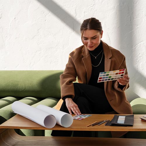
When testing a color, evaluate a sufficiently large sample and view it from different
angles and locations in the room. Move the sample between lighter and darker areas so
you can see how the color behaves under changing lighting conditions before making your final decision.
Official Source: Benjamin Moore – How to Use Paint Color Samples
Choosing the Right Color Combination
- Consider Lighting – Natural and artificial lighting affect how colors appear in a room.
- Think About Mood – Warm colors energize, while cool tones create a calming effect.
- Match with Furniture – Ensure your color choices complement your existing décor.
- Use the 60-30-10 Rule – 60% dominant color, 30% secondary color, and 10% accent color.
- Test Before Committing – Sample different shades to see how they look in your space.
Never finalize an interior paint color from a digital image or small color chip alone.
Test the color in the actual room and observe it under both natural and artificial lighting
at different times of day. Lighting can significantly change how the color and its undertones appear.
Official Source: Benjamin Moore – How to Choose Paint Colors
Advanced Color Theory for Interior Design
Understanding Warm vs. Cool Colors
Warm colors like red, orange, and yellow create an energetic environment, while cool colors such as blue, green, and purple promote relaxation and calmness.
Monochromatic vs. Complementary Schemes
- Monochromatic schemes use different shades of the same color for a cohesive look.
- Complementary colors are opposite on the color wheel, creating a striking contrast.
The Role of Textures and Patterns
Adding textured materials like velvet, linen, or wood enhances the depth of a color scheme, making it more dynamic and visually appealing.
How Lighting Changes Interior Color
Color should never be selected from a digital screen or small swatch alone. The same paint color can appear noticeably different depending on the amount, direction, and type of light in a room. Natural daylight, warm artificial lighting, and cooler LED lighting can all influence how undertones are perceived.
For example, a warm neutral may look soft and creamy in a room with warm lighting but appear more muted under cooler daylight. Likewise, blue and green shades can become more prominent in naturally bright rooms, while darker colors may feel deeper and more dramatic in spaces with limited natural light.
This is especially important in open-concept homes where one color may continue through several areas with different windows, light sources, and orientations. Instead of choosing a color based only on how it looks in a showroom or online, evaluate it in the actual room where it will be used.
Benjamin Moore recommends testing paint samples in the home and viewing them under both natural and artificial lighting at different times of day.
Best practice: Test your leading color choices on large sample areas and observe them in the morning, afternoon, and evening before making a final decision.
How to Build a Whole-Home Color Palette That Feels Connected
Choosing colors room by room can create a home that looks attractive in individual spaces but disconnected as a whole. A better approach is to establish a consistent color palette that allows each room to have its own personality while maintaining visual continuity throughout the home.
Start with one dominant neutral or foundational color that can appear across multiple areas. From there, introduce secondary colors through walls, cabinetry, furniture, textiles, artwork, and architectural details. Accent colors should be used selectively rather than introducing a completely different palette in every room.
For open floor plans, color relationships become even more important. Living rooms, kitchens, dining areas, and hallways should share at least some visual connection through repeated undertones, materials, or accent colors.
A practical approach is to choose three to five related colors and assign them different roles. One can serve as the primary background color, another can support architectural features or furniture, and one or two accent colors can add personality.
This creates a more intentional result than simply selecting individually attractive colors. The goal is not for every room to look identical, but for the entire home to feel like one thoughtfully designed environment.
2026 Interior Color Trends: Soft Neutrals, Layered Contrast, and Personal Expression
Color trends are useful for inspiration, but they should not replace the specific characteristics of your home. In 2026, one notable direction is the move toward softer, more adaptable neutrals combined with carefully controlled contrast.
Pantone selected PANTONE 11-4201 Cloud Dancer as its 2026 Color of the Year, describing the shade as a light, airy white associated with simplicity, calm, and clarity. Pantone also presents Cloud Dancer as a versatile structural color that can work as a foundation or be combined with contrasting and complementary shades.
For residential interiors, this direction can translate into warm whites, creamy neutrals, muted greens, soft blue-greens, natural wood tones, and carefully selected darker accents. Rather than relying on a single trend color, homeowners can use these shades as part of a layered palette.
The most timeless approach is to use trend-driven colors in elements that can be changed relatively easily, such as furniture, artwork, textiles, decorative accessories, or smaller accent areas. More permanent decisions—such as kitchen cabinetry, flooring, tile, and large-scale wall treatments—should be based on the home’s architecture, lighting, materials, and long-term preferences.
Use current color trends as inspiration rather than as a complete design formula.
A versatile neutral can provide the foundation, while stronger colors can be introduced
through accents, furniture, artwork, and other elements that are easier to update over time.
For 2026, Pantone’s Cloud Dancer demonstrates how a soft, adaptable white can function as
a foundation for both subtle palettes and stronger contrasts.
Conclusion
Finding the best color combinations for home design requires a balance between aesthetics and functionality. Whether you prefer classic elegance or modern trends, the right colors can transform your home. If you’re looking for expert guidance, Builpire specializes in home renovation and interior design, ensuring your space is both stylish and comfortable. Let their expertise help you create a home that reflects your personality and enhances your lifestyle.
For more ideas and guidance, follow us on Instagram.
Frequently Asked Questions About Home Color Combinations
What are the best color combinations for a modern home?
Some versatile combinations include warm white with natural wood, soft gray with deep blue,
cream with sage green, charcoal with warm beige, and off-white with muted earth tones.
The best choice depends on the home’s lighting, existing materials, furniture, flooring,
and architectural style. Instead of selecting colors independently, consider the undertones
of permanent elements first and build the palette around them.
How do I choose the right paint color for a room?
Start by evaluating the room’s natural and artificial lighting, existing finishes, furniture,
and the atmosphere you want to create. Narrow your choices to a few colors and test physical
samples in the actual room. Viewing samples at different times of day is important because
lighting can significantly change how a color appears.
What colors make a small room look bigger?
Soft whites, warm off-whites, light beige, pale gray, and muted blue-green can help create
a lighter and more open appearance. Using closely related colors across walls and larger
elements can also reduce visual breaks. However, lighting, furniture scale, finishes, and
visual clutter should be considered along with the paint color.
Should I use the same color throughout my entire home?
Not necessarily. A better approach is often to create a connected color palette. Use one or
two foundational colors throughout key areas, then introduce complementary colors or accents
in individual rooms. This creates visual continuity without making every space look identical.
How can I use bold colors without overwhelming a room?
Introduce bold colors selectively through an accent wall, kitchen island, cabinetry, furniture,
artwork, rugs, or accessories. Pairing stronger colors with quieter neutrals can maintain balance.
Before committing to a large application, test the color in the actual room and observe it under
different lighting conditions.