









Embracing Modern Living Room Color Combination Ideas
Choosing the right living room color combination ideas can transform your space, improve visual balance, and create an atmosphere that reflects your lifestyle. In 2026, modern living room design embraces nature-inspired greens, warm neutrals, sophisticated blues, and carefully balanced accent colors. Whether you’re planning a complete home renovation or simply refreshing your walls and furnishings, the right color palette can help you create a living room that feels cohesive, inviting, and timeless. In this guide, Builpire explores 10 stylish color combinations, along with practical tips for choosing shades that complement your natural lighting, furniture, and interior design style.
Article Summary
- The right living room color combination depends on your design preferences, natural lighting, existing furnishings, and the atmosphere you want to create.
- Nature-inspired shades, balanced neutrals, and bold accent colors offer different ways to personalize a modern living room.
- Testing paint samples in your actual space helps you understand how colors change under natural and artificial lighting.
- Matching wall colors with sofas, area rugs, flooring, and artwork creates a more cohesive interior design.
- Small living rooms can benefit from lighter colors, coordinated palettes, and thoughtful contrast, but darker shades can also work when used intentionally.
- Professional design guidance can help homeowners evaluate color options, coordinate finishes, and develop a practical renovation plan tailored to their home.

Transform Your Space with BUILPIRE – Book Your Consultation Today!
1. Olive Green and Soft Beige
This earth-toned pair is perfect for those who want a cozy, grounded atmosphere. Olive green brings in a natural, calming vibe while soft beige keeps the space open and warm. Ideal for minimalist or Scandinavian-style interiors, this combo is both timeless and trendy.
2. Navy Blue and Cream
A bold yet balanced duo, navy and cream evoke sophistication and serenity. Navy creates depth and drama, while cream adds lightness. Use this combo for accent walls, plush sofas, and creamy drapes. It’s one of the most luxurious living room color combination ideas this year.
3. Mustard Yellow and Charcoal Gray
Looking for a splash of vibrancy? Mustard yellow provides the energy, while charcoal tones it down for balance. This mix suits modern and industrial living rooms and works especially well with natural textures like wood and metal.
4. Sage Green and Terracotta
Nature-inspired and effortlessly stylish, sage and terracotta reflect the popular biophilic design trend. These colors bring warmth and tranquility and are perfect for rustic or boho interiors.
5. Sky Blue and Soft White
Sky blue invokes calm and relaxation, making it an excellent choice for a family-friendly space. When paired with soft white, it maintains brightness while offering a peaceful retreat-like feel.
6. Dusty Rose and Warm Taupe
Romantic and muted, this pairing is subtle yet impactful. It adds a soft feminine touch without overwhelming the space. Incorporate these tones through plush throws, pillows, and area rugs.
7. Deep Plum and Blush Pink
Unexpected yet elegant, deep plum and blush pink offer a rich contrast that feels both dramatic and delicate. Use blush on larger surfaces and plum as an accent for a balanced look.
8. Burnt Orange and Navy Blue
Burnt orange, when paired with deep navy, adds warmth and character. It’s great for creating a moody, artistic vibe. Consider this for accent chairs, artwork, or feature walls.
9. Teal and Light Gray
Teal is bold and refreshing, while light gray tones it down for a more livable palette. Great for contemporary or eclectic interiors, this pairing works across both modern and vintage aesthetics.
10. Black and White with Emerald Accents
A classic black-and-white scheme gets an upgrade with pops of emerald green. This is one of the most refined living room color combination ideas, giving a space instant sophistication.
How to Match Living Room Wall Colors With Existing Furniture
You do not need to replace your furniture to create a cohesive living room. In many cases, the easiest way to develop a successful color palette is to start with the pieces you already own. A sofa, area rug, artwork, or even a patterned cushion can provide the foundation for your entire color scheme.
Start With Your Largest Furniture Pieces: If your sofa is charcoal gray, consider warm white, muted sage, or soft greige walls for a balanced look. A beige sofa can work beautifully with olive green, dusty blue, or deeper earthy accents. For a navy sofa, creamy white walls and natural wood finishes can keep the room from feeling too heavy.
Identify the Undertones: Beige, gray, and white are not always neutral in the same way. Some shades lean toward yellow or red, while others have blue or green undertones. Look at your flooring, upholstery, and existing finishes together to avoid combinations that feel disconnected.
Use Your Area Rug as a Color Guide: A patterned rug can bring several colors into one space. Choose one dominant shade for the walls, a secondary shade for accent furniture or curtains, and a smaller contrasting color for cushions or decorative accessories.
Balance Bold Furniture With Quieter Walls: If you already have a statement sofa, colorful artwork, or patterned upholstery, a restrained wall color can help those features stand out. Alternatively, neutral furniture gives you more flexibility to experiment with a richer wall color.
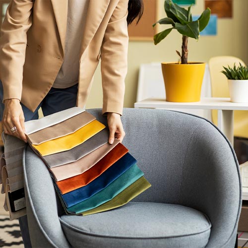
Before purchasing paint, place fabric samples, flooring samples, and paint swatches together in the actual room. This simple step helps you evaluate the palette as a whole rather than choosing each element in isolation.
The goal is not to match every item perfectly. It is to create a visual connection between the colors, textures, and materials that make your living room feel intentional.
Two shades of beige, gray, or white may look similar on a paint card but create noticeably different results when placed next to the same sofa, flooring, or cabinetry. Benjamin Moore explains that neutral paints can have warm or cool undertones that influence how they interact with surrounding finishes. Compare your shortlisted colors side by side with your existing materials instead of evaluating each shade in isolation. This is especially useful when coordinating wall paint with wood floors, stone surfaces, gray upholstery, or cream-colored trim.
Source: Official Benjamin Moore Guide to Warm and Cool Colors
Why Color Pairings Matter in 2026
In 2026, living room color combination ideas are moving beyond simple aesthetic decisions. They now represent lifestyle choices, mental wellness, and even eco-conscious living. From sustainable paint brands to natural fiber decor, every element of your color decision can reflect your values.
Tips for Choosing the Right Color Combo
- Understand Your Space: Smaller living rooms benefit from lighter tones, while larger rooms can carry bold hues.
- Consider Natural Light: The amount of light in your space affects how colors appear throughout the day.
- Balance with Neutrals: Even in bold color combos, grounding the space with neutrals ensures harmony.
- Test Before You Commit: Always sample colors in your actual room to see how they look under your specific lighting conditions.
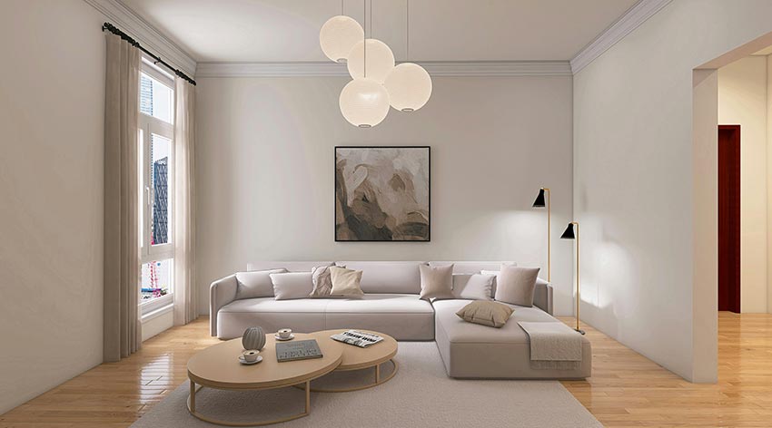
How to Choose Living Room Colors Based on Natural Light
Natural light can dramatically change how a paint color looks throughout the day. A shade that appears warm and inviting in the morning may look cooler or more muted in the afternoon. Before choosing from different living room color combination ideas, consider the direction your windows face, how much sunlight enters the room, and when you use the space most often.
North-Facing Living Rooms: These rooms often receive cooler, less direct natural light. Warm whites, soft beige, creamy neutrals, and muted terracotta accents can help create a more welcoming atmosphere without making the room feel overly dark.
South-Facing Living Rooms: These spaces generally receive stronger natural light for much of the day. Sage green, warm gray, soft blue, and balanced neutral shades can complement the brightness while preventing the overall palette from feeling too intense.
East-Facing Living Rooms: Morning sunlight can make colors appear warmer, while the room may feel cooler and less bright later in the day. Warm off-white, pale greige, and muted blue-green tones can provide a flexible starting point.
West-Facing Living Rooms: These rooms often receive warmer, more intense afternoon light. Soft gray with balanced undertones, muted green, or a neutral beige can help create a comfortable visual balance.
These are starting points rather than strict rules. Window size, trees outside, nearby buildings, flooring, and artificial lighting can all influence the final result. For a more reliable decision, test paint samples on different walls and observe them in morning, afternoon, and evening light before committing to a full room.
Before committing to a full-room repaint, compare a few paint samples in the room where they will be used. Benjamin Moore recommends applying samples in sufficient coverage and evaluating them under different lighting conditions. Observe each option on different walls throughout the day and under your usual evening lights. This helps you identify undertones that may look different from what you saw on a screen or color card and reduces the risk of choosing a shade that feels wrong once the entire room is painted.
Best Living Room Color Combinations for Small Spaces
Choosing colors for a small living room is not simply about making everything white. The right combination depends on the room’s natural light, ceiling height, furniture scale, and the atmosphere you want to create. Thoughtful contrast can add depth, while a coordinated palette can help the space feel more visually connected.
1. Warm White and Light Greige: This combination creates a soft, understated backdrop that works well with wood furniture, linen curtains, and neutral upholstery. It is a practical option for homeowners who want a bright room without an overly stark appearance.
2. Pale Blue and Soft White: Light blue can introduce color without dominating a compact space. Pair it with soft white trim, simple furniture, and understated accessories for a fresh, relaxed look.
3. Sage Green and Cream: Muted sage adds character while cream helps maintain a warm, balanced appearance. Natural wood, woven textures, and plants can reinforce the palette without introducing too many competing colors.
4. Light Taupe and Dusty Blue: This pairing offers more depth than an all-white scheme while remaining relatively subtle. Use light taupe as the main wall color and introduce dusty blue through an accent chair, cushions, artwork, or curtains.
5. Monochromatic Beige With Contrasting Textures: Combining different shades of beige, sand, and cream can create visual interest without relying on strong color contrasts. Textured upholstery, wood grain, layered rugs, and varied finishes help prevent the room from feeling flat.
For the most cohesive result, consider carrying a similar wall color onto adjoining spaces when the rooms are visually connected. Keep larger furniture pieces proportionate to the room, use lighting strategically, and avoid introducing too many unrelated accent colors.
Dark colors are not automatically unsuitable for small living rooms. A deep green or navy can create an intimate, sophisticated atmosphere when supported by appropriate lighting and a deliberate furniture layout. The best choice is the one that suits the room’s actual conditions and the way you want to use it.
Light paint colors can help a compact living room feel brighter and more open, but the result also depends on daylight, ceiling height, furniture proportions, and lighting placement. Benjamin Moore identifies pale neutrals and soft blues as useful options for creating a more spacious visual effect. However, a darker palette can be appropriate when the goal is a cozy, intimate setting. Before selecting a scheme, define the atmosphere you want, assess the room’s natural light, and coordinate the wall color with the largest furnishings. A room-specific decision is more reliable than a blanket rule that every small space must be white.
Working with a Design Professional
If you’re overwhelmed by the many living room color combination ideas available, it might be wise to consult a professional. Designers can help tailor color schemes to your preferences, ensuring a cohesive and polished result.
About Builpire
When it comes to turning visionary designs into stunning realities, Builpire stands out as a leader in home renovation and interior design. With a keen eye for trend-forward living room color combination ideas, Builpire helps clients craft interiors that are not only beautiful but also functional and reflective of their unique personalities. Whether you need a full-scale makeover or a subtle refresh, Builpire has the expertise to deliver results that exceed expectations.
For more ideas and guidance, follow us on Instagram.
Frequently Asked Questions About Living Room Color Combinations
What is the best color combination for a modern living room?
There is no single color combination that works best for every modern living room. Warm white and beige create a relaxed, versatile backdrop, while navy and cream offer a more defined contrast. Sage green and warm taupe suit homeowners who prefer natural, understated colors, and charcoal with soft white can create a sharper contemporary look. The best choice depends on your natural light, existing furniture, flooring, and preferred design style. Before making a final decision, test paint samples in your room and compare them with your main furnishings.
What colors make a small living room look bigger?
Light neutrals, warm whites, pale blues, and soft greens can help a small living room feel brighter and more open, especially when the room receives limited natural light. Using related colors on walls, trim, and adjoining spaces can also reduce visual interruptions. However, lighter paint alone cannot change the room’s actual dimensions. Furniture scale, window treatments, lighting, and visual clutter matter too. Darker shades can still work when the goal is a cozy, intimate atmosphere rather than a brighter, more expansive appearance.
How many colors should you use in a living room?
A practical starting point is to choose three coordinated color roles: a dominant color for larger surfaces, a secondary color for furniture or textiles, and an accent color for smaller details. For example, warm white walls, a beige sofa, and olive green cushions can create a cohesive palette. This is a flexible design guideline rather than a strict rule. Patterns, wood finishes, metals, artwork, and natural materials can introduce additional visual variety without making the room feel disorganized, provided their undertones and intensity work together.
Should living room walls be lighter or darker than the furniture?
Neither approach is universally correct. Lighter walls behind darker furniture can create clear contrast and help statement pieces stand out. Darker walls behind lighter furniture can produce a dramatic, layered effect. If both the walls and furniture are similar in value, differences in texture, material, and finish become more important for creating depth. Consider the size of the room, the amount of daylight, and the visual weight of your largest furniture pieces before deciding. Testing samples alongside the actual upholstery and flooring is more reliable than following a fixed light-versus-dark rule.
How can I test living room paint colors before repainting?
Start by narrowing your options to a few shades that complement your furniture, flooring, and lighting. Apply paint samples to representative areas or use movable sample boards, following the paint manufacturer’s instructions. View each sample on different walls and at different times of day, including under your usual evening lighting. Compare undertones rather than relying only on a small color chip or a digital image, since screens and lighting can affect color perception. Once you are confident in the shade, confirm the appropriate paint finish and product for your walls before purchasing the full quantity.